Helen Bamber Foundation
Updated and redesigned visual identity.

In a nutshell:
Dignity restored. Strength regained. The Helen Bamber Foundation is a pioneering Human Rights charity supporting survivors of trafficking and torture.
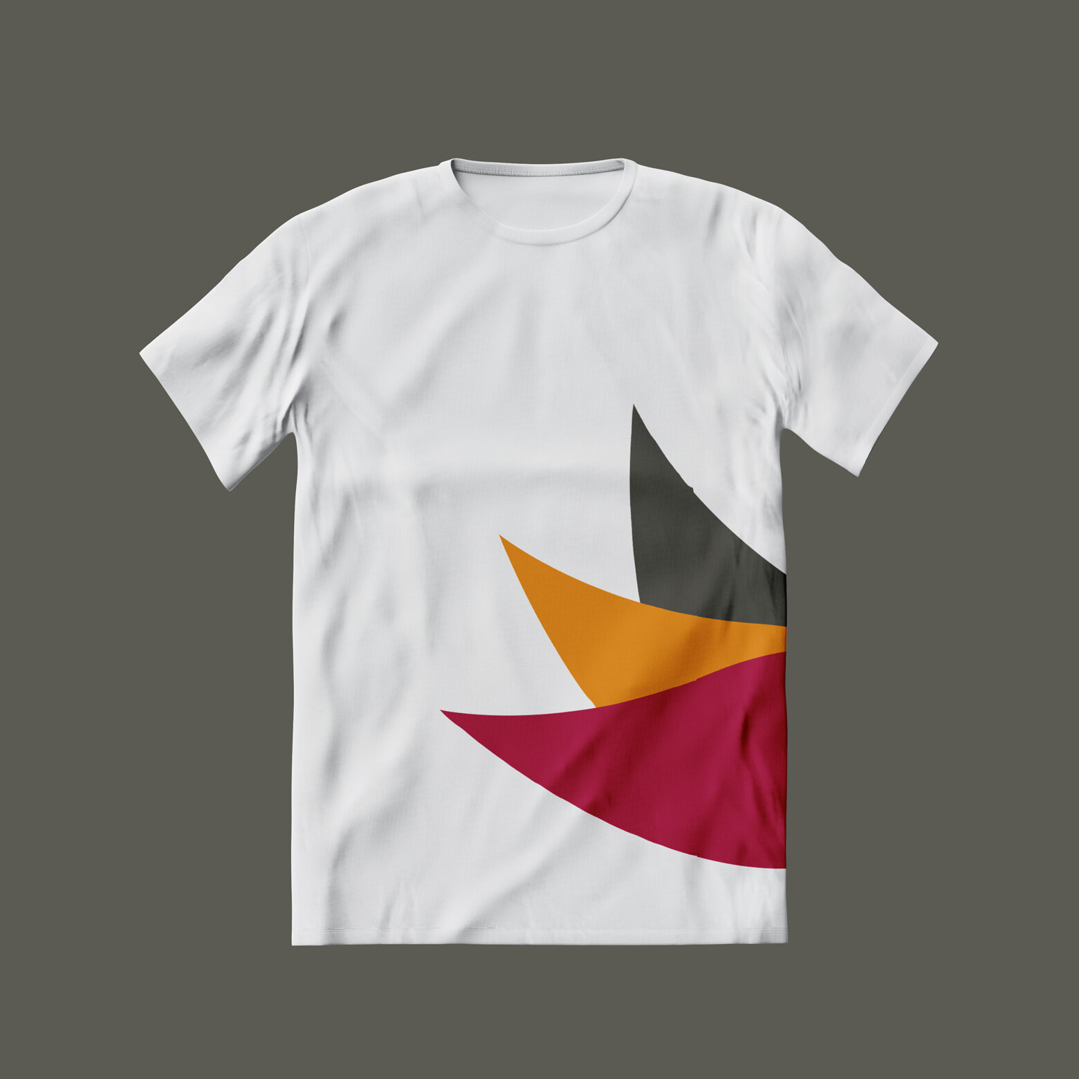
strength to fly
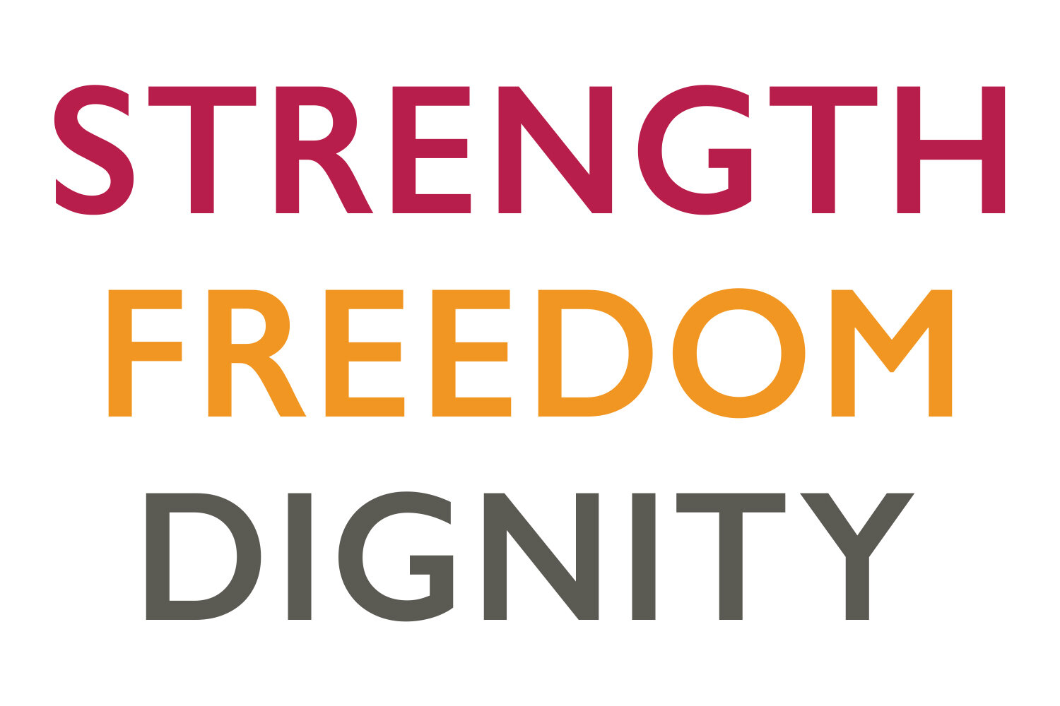
With the symbolism of the wings, we brought their brand platform to life visually. The three elements of the wings stand for strength (red,) freedom (yellow) and dignity (grey.)
The Brand Catalyst crafted an initial visual centre point, keeping the brand platform “Strength to fly” in focus, giving it an impactful outset with elegant colour-ways, fonts, logos and roll out across digital divers and merchandise.